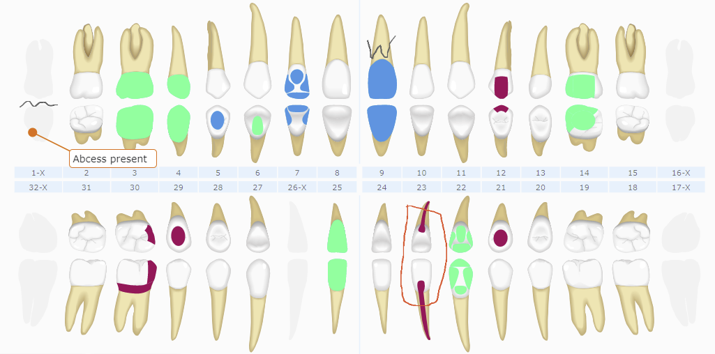
You spoke and we listened. The Curve Dental team has been hard at work putting together a plan to create a best-in-class charting experience to help you provide excellent patient care. We are excited to share the first step in our plan with you, and to provide a sneak peak on what else is soon to come.

Who we talked to
We gathered as much information and data as possible to guide our decision making. We engaged a panel of dental professionals from the US and Canada, from a variety of practices, to help us validate our design proposals and direction. We surveyed our customers and consulted industry experts to gather additional insights. In addition, we also mined usage data and customer Charting requests to help shape our plans and decisions.
The informative insights from our panel and customer requests, along with the enormous response volume to our surveys, helped us understand the key factors users expect when charting. Our paramount goal was to understand how we could provide our customers with the best possible user experience when using Charting.
What we learned
As we worked through the project and engaged with our expert panel, we realized simplifying the Charting module would result in a more effective clinical experience. Overwhelmingly, our panel and survey respondents maintained the importance of “keeping it simple”.
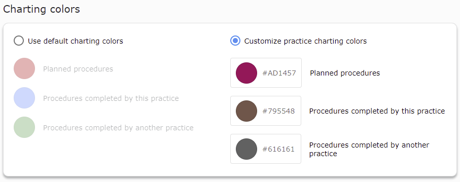
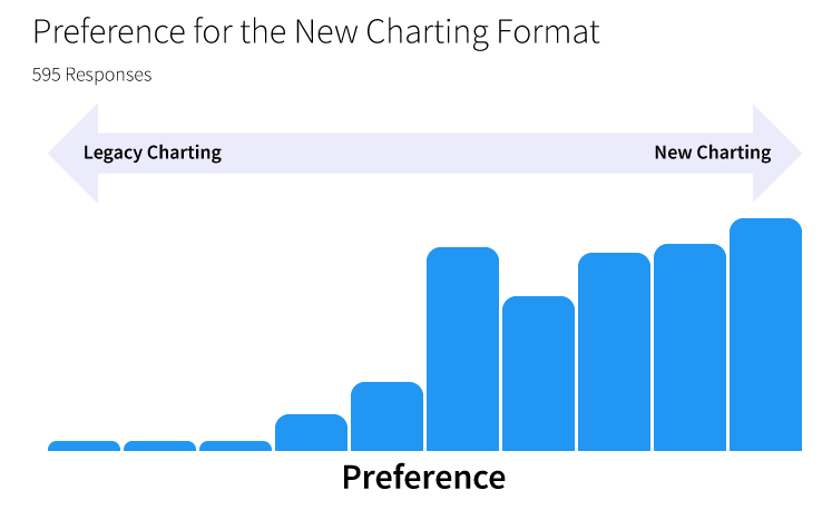
What we learned is that dentists want the Chart to quickly and easily communicate what procedures are planned, what procedures their practice previously completed, and what procedures were performed by another practice. This feedback led to the adoption of a three color representation for the procedure status category in the new chart. As providers indicated their preference to choose the color for each procedure status category, we included a practice-level setting to customize these colors in the Administration module. When we surveyed customers to validate our designs, we found that there was a considerable amount of support for using a simplified color scheme in the Chart.
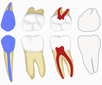
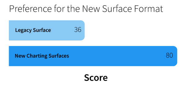
Following up on the need to make the charting experience more clear and direct, we evaluated how surfaces were used and displayed in the Chart. Our expert panel was instrumental in our decision to simplify the surface presentation, and this was backed up by customer survey feedback. Feedback also led us to adjusting the overall orientation of the teeth to ensure all surfaces are accessible and easy to see.
This feedback led to the adoption of a three color representation for the procedure categories in the new chart. Additionally, the default color for each procedure category was not intended to be practical. As providers indicated their preference to choose the color for each procedure category, we included a practice-level setting to customize the procedure category colors in the Administration module.
An additional benefit of these approaches is that we can minimize the performance impact on a chart full of procedures. This means faster charting!
Where do we go from here?
To reiterate, what we’ve released for Charting so far is just the beginning. We have big plans and are busily working on the next phase.
In the next phase we will continue to build on the foundation we have laid to provide fast, efficient charting to provide excellent patient care. Specifically we will provide:
- Configurable set of favorite or quick buttons to provide easy click access to quickly chart procedure codes or add line items to the treatment plan
- Customizable Charting menu to allow complete control of the chartable procedures
- Improved condition workflow to allow easy stamping of standard conditions, without needing to free-hand
We are so excited to continue to innovate our Charting module for our providers. We welcome any feedback you may have, for incorporation into our next phases.
